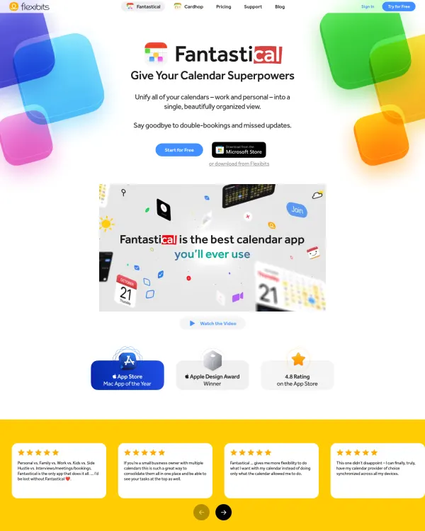
Fantastical app site
flexibits.com, Flexibits
Color palette inspiration is a set of colors that already work together in real designs. This page shows palettes with the share each color takes, so you see how much accent to use.
5 designs match the filters, newest first
flexibits.com, Flexibits
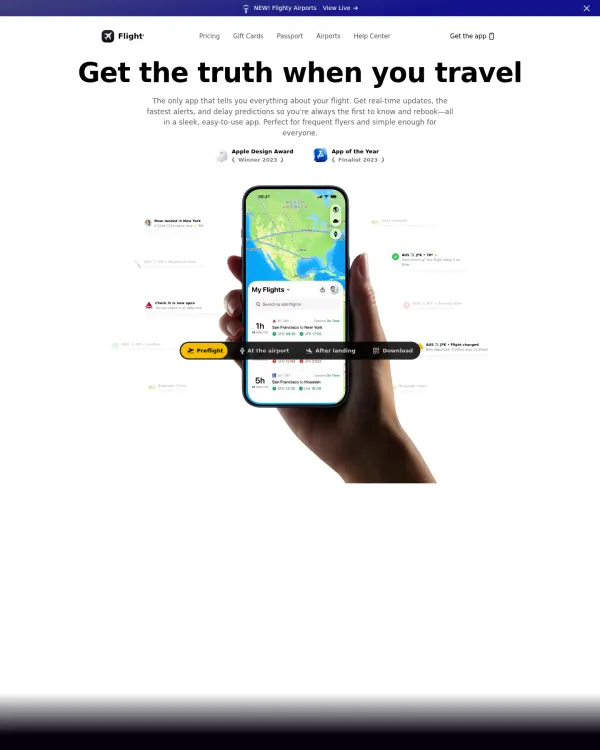
flighty.com, Flighty
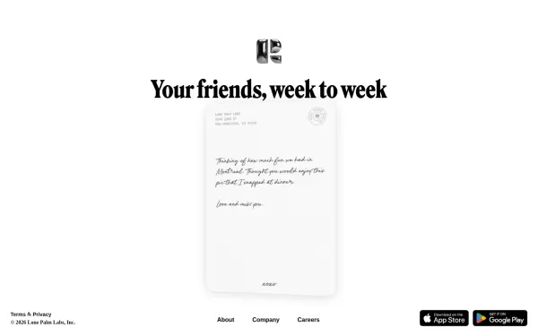
retro.app, Retro
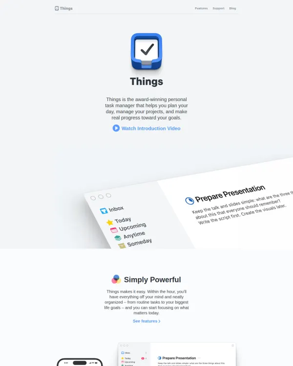
culturedcode.com, Cultured Code
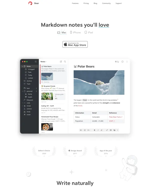
bear.app, Shiny Frog
About colors
Most strong palettes are quiet. A large neutral area, a main color, and a small accent for emphasis. Because each palette comes from a finished design, you see how the colors behave with real type and space.
On DesignPorn you can search color palettes in plain words, or upload a screenshot to find designs like it. Open any item to see its palette with share, its heading and body fonts, and its spacing base unit. Save the best to a board and send it to a client by private link. Every item has a source link and a credit to its author. Next, look at typography inspiration.
Keep going with typography inspiration, branding inspiration and graphic design inspiration.
Pattern breakdown
Counted over the 193 curated colors in the library.
193
Designs
27%
Use a dark canvas
4 px
Most common base unit
Share of designs where the hue covers part of the page.
FAQ
Start with a neutral, add one main color, then one accent. Test the contrast of text.
It is how much of the design each color covers.
Yes. Filter by hue or search in plain words, such as warm and calm.
Aim for a ratio of at least 4.5 to 1 for body text.
Describe the look in plain words or upload a screenshot. The first search needs no account.