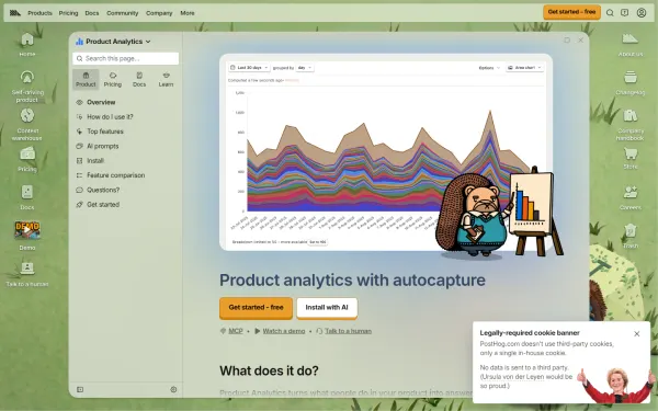
PostHog Product Analytics page
posthog.com, PostHog
Dashboard UI examples are real screens that show data at a glance. The best put the key number first, group related data, and use color to mean something.
1 design match the filters, newest first
posthog.com, PostHog
About dashboards
Dense screens test every design choice. Compare how products arrange key numbers, charts, tables and filters. Our guide to dashboard UI examples explains the patterns behind them.
On DesignPorn you can search dashboards in plain words, or upload a screenshot to find designs like it. Open any item to see its palette with share, its heading and body fonts, and its spacing base unit. Save the best to a board and send it to a client by private link. Every item has a source link and a credit to its author. Next, look at ui inspiration.
Keep going with ui inspiration, saas website design and app design inspiration.
Pattern breakdown
Counted over the 9 curated dashboards in the library.
9
Designs
44%
Use a dark canvas
4 px
Most common base unit
Share of designs where the hue covers part of the page.
FAQ
Clear priority, steady spacing, meaningful color and tables that scale. A user answers their main question quickly.
Line for change over time, bar for comparing categories, table for exact values.
They need softer contrast and lower chart saturation, but they suit long sessions.
Yes. Upload a dashboard screenshot to find similar layouts.
Describe the look in plain words or upload a screenshot. The first search needs no account.